jueves, 3 de noviembre de 2011
Beijing Typography 2009
In 1928, in his book entitled The New Typography, Jan Tschichold wrote "Unity of life: the arbitrary isolation of a part is no longer possible for us - every part belongs to and harmonizes with the whole. Where slackness is still the rule, we must make it our work to fight against laziness, envy, and narrow-mindedness. Typography too must now make itself part of all the other fields of creativity."
Almost a century has passed, yet we are still able to sense a similar freshness and eclecticism in our current digitalized age. Typography as a tool for information communication not only engages traditional mediums (such as books and posters), but is also permeating into new mediums such as space, interactive media and motion graphics. Contemporary typography demonstrates new possibilities, both in terms of words and images, and form and concept. Designers are adhering to the traditional, whilst looking forward to the unexpected. As a result, various understandings of and discussions on typography have started to emerge.
Chinese characters, for example, symbolize both word and image, indicating sound and meaning. In its five thousand-year history as a language system that incorporates pictograms, ideograms and phonograms, the Chinese language has evolved into a highly sophisticated writing culture, illustrated by the creation of the first form of (wood-based) printing. Furthermore, the idea of calligraphy as a "sophisticated art" has influenced many countries worldwide. Over the last 30 years, however, a new set of technological difficulties have been confronted and overcome, including the migration from traditional writing and mechanical systems to a digitalized one.
Blessed with their rich typographic history, designers are simultaneously confronted with many problems. For instance, what does typography mean in the face of the technological and socio-cultural transformations of today? Can anyone become a designer when equipped with computer technologies and digitized type? In what ways has new life affected typography and designers?
To showcase the research and international efforts of the past couple of years, as well as the re-thinking of the complex nature of typographic art, we cordially invite you to participate in bt'09, an exhibition founded on the theme of "Typography, Unity with New Life."...
http://facesofdesign.com/event/beijing-typography-2009
Etiquetas:
A hand-rendered typeface
JAN TSCHICHOLD, a Master of Typography
Jan Tschichold () was as indispensable to modern typography. In his books and magazine articles, Tschichold codified what is called the “New Typography,” characterized by sans-serif typefaces and asymmetrical composition.
http://retinart.net/artist-profiles/jan-tschichold/
http://amassblog.com/?p=127
,
http://retinart.net/artist-profiles/jan-tschichold/
http://amassblog.com/?p=127
,
Etiquetas:
A hand-rendered typeface
Acht Argentinisce Abstracten - W. Sandberg - 1961 Stedelijk Museum
Willem Sandberg (1897-1984) is best known for his graphic work during his time as curator of the Stedelijk Museum in Amsterdam.
The dutch typographer designed over 320 catalogues promoting the museums exhibitions, many of which were mostly created in his own time after focussing on the day-to-day museum logistics. Frequently tearing letter shapes and overprinting primary colours of red and blue his work has inspired generations of designers.
Etiquetas:
A hand-rendered typeface
XXth Century Avantgarde Books
Etiquetas:
A hand-rendered typeface
ICONOGRAPHICS
Etiquetas:
A hand-rendered typeface
Pioneers of modern typography (Herbert Spencer, 1969)
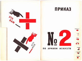
Herbert Spencer Pioneers of Modern Typography has been the encyclopedia of Avant Guarde typography for many decades. Featuring such inspirational pioneers as, El Lissitzky, Theo van Doesburg, Alexander Rodchenko, Jan Tschichold. The book documents the rise of this movement from the the publication of Marinetti’s Futurist manifesto, to New Typography.
The book have biographical information of some artists as:
The book have biographical information of some artists as:
Lund Humphries
Kurt schwitters
Herbert Bayer
Piet Zwart
Theo van Doesburg
Paul Schuitema
El Lissitzky
Etiquetas:
A hand-rendered typeface
ALEXANDER RODCHENKO
Aleksandr Rodchenko (1891-1956), one of the leading Russian artists in the period following the Revolution of October 1917.
http://www.moma.org/interactives/exhibitions/1998/rodchenko/texts/graphic_design.html
http://www.moma.org/interactives/exhibitions/1998/rodchenko/texts/lef.html
http://www.moma.org/interactives/exhibitions/1998/rodchenko/
http://www.moma.org/interactives/exhibitions/1998/rodchenko/texts/graphic_design.html
http://www.moma.org/interactives/exhibitions/1998/rodchenko/texts/lef.html
http://www.moma.org/interactives/exhibitions/1998/rodchenko/
Lendiz: The books on all spheres of knowledge
Read the "Molodaya gvardiya"("Young guard") magazine...
Rodchenko A. M., Majakovskij V. V., 1924
The advertisement of GUM. The most business, the tidiest
The Trehgornoye Beer will drive out hypocrites and samogon
Majakovskij V. V., Rodchenko A. M., 1925
More poters: http://eng.plakaty.ru/authors?id=75&sort=lname
Arvatov about Mayakovsky
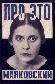
Vladimir Mayakovsky Pro Eto cover desing, 1923
Left front of the arts (LEF)
Etiquetas:
A hand-rendered typeface
H.N. WERKMAN
Dutch designer and printmaker Hendrik Werkman (1882–1945) is best known for his innovative printing techniques and avant-garde typography. As publisher of De Blauwe Schuitt, a series of underground booklets produced by Jewish dissident poets and writers during the Nazi occupation of Holland, Werkman was imprisoned by German secret police in 1945 and executed without trial just three days before the country’s liberation. This generously illustrated book is the first in English to focus on Werkman’s remarkable graphic work and fascinating life.
Werkman founded his own printmaking shop in 1908. His self-produced magazine The Next Call was published in 1923 and included typographical and other printmaking experiments as well as the designer’s own Dadaist poems and texts. Werkman also developed a printmaking process he called “hot printing,” a technique incorporating found materials that added repeated design elements directly onto the paper—all without the use of a printing press. Although much of his work was destroyed at the time of his execution, the remarkable examples that remain tell the story of a maverick designer and typographer whose graphic vision was playful, bold, experimental, and unwaveringly optimistic.
Werkman founded his own printmaking shop in 1908. His self-produced magazine The Next Call was published in 1923 and included typographical and other printmaking experiments as well as the designer’s own Dadaist poems and texts. Werkman also developed a printmaking process he called “hot printing,” a technique incorporating found materials that added repeated design elements directly onto the paper—all without the use of a printing press. Although much of his work was destroyed at the time of his execution, the remarkable examples that remain tell the story of a maverick designer and typographer whose graphic vision was playful, bold, experimental, and unwaveringly optimistic.
Etiquetas:
A hand-rendered typeface
Suscribirse a:
Comentarios (Atom)


